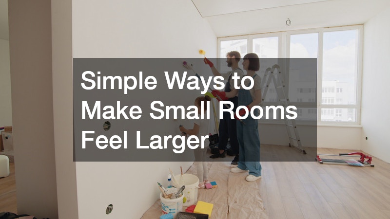
Small rooms have a way of dictating how people live in them — cramped furniture arrangements, limited storage, the constant sense that walls are closing in. But the square footage itself is rarely the whole problem. More often, it’s how light, color, proportion, and furniture placement interact that determines whether a room feels tight or spacious. Understanding those relationships gives homeowners real leverage, because most of the most effective changes cost far less than a renovation and don’t require moving a single wall.
Color, Light, and the Illusion of Space
The relationship between color and perceived space is well-documented in interior design practice. Light, cool-toned hues — soft whites, pale grays, and muted blues — reflect more light and cause surfaces to visually recede, making a room feel less enclosed. Dark walls do the opposite: they absorb light and draw surfaces closer, which can feel suffocating in a room that’s already small.
Where many people go wrong is treating the ceiling as an afterthought. Painting it a shade slightly lighter than the walls pulls it upward visually. A ceiling painted the same shade as the walls tends to flatten the room; one painted darker pulls it down even further. The gain from this single decision costs nothing beyond an extra quart of paint.
Natural light matters just as much. Heavy drapes block light and visually crowd the perimeter of a room. Replacing them with sheer panels or roller shades allows more daylight in while keeping the wall space around windows feeling open. Hanging curtain rods 4 to 6 inches above the window frame — rather than directly at the frame — creates the impression of taller walls without any structural work.
Mirrors placed opposite a natural light source amplify both brightness and perceived depth. A single large mirror on a wall opposite a window can effectively double the visual volume of a room. This is more impactful than multiple small mirrors, which tend to fragment the space rather than expand it.
Artificial lighting deserves the same attention as natural light. Overhead fixtures positioned at the center of a room distribute light evenly but create a flat, compressed effect. Supplementing with floor lamps or sconces placed in corners draws the eye outward toward the room’s edges, making the boundaries feel farther away. Warm-toned bulbs around 2700K also tend to blend more seamlessly with wall color than cool fluorescent light, which can create harsh contrasts that emphasize a room’s limits.
Furniture Scale, Placement, and Proportion
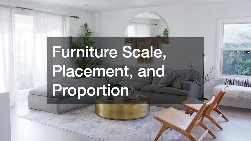
Oversized furniture is the most common reason a correctly-sized room feels small. A sectional sofa that seats eight might be practical in a large open plan, but in a 12 by 14 foot living room, it becomes a wall in itself. The fix isn’t necessarily to buy new furniture — it’s to understand scale relative to the room’s actual dimensions.
Before rearranging or replacing, measure the room’s total floor area and sketch a rough floor plan to scale. Furniture that covers more than 60 percent of usable floor space will almost always make the room feel congested, regardless of how it’s arranged.
Leggy furniture — pieces raised off the floor on visible legs — creates negative space beneath them, which breaks up the visual mass and lets the eye travel further across the floor. A sofa with a visible base reads as lighter than a skirted one of identical size. This applies equally to beds, dining chairs, and accent tables.
- Choose a sofa with a seat height between 17 and 19 inches and visible legs of at least 4 inches to maintain visual flow beneath the piece.
- Keep the largest furniture piece against the longest wall to preserve open floor space at the room’s center.
- Limit a small room to one large focal-point piece — a statement sofa or bed — rather than competing anchor pieces that divide attention and visually shrink the space.
Floating furniture slightly away from walls — 2 to 3 inches — rather than pushing everything to the perimeter is a counterintuitive but effective technique. Pulling pieces inward creates breathing room along the walls and makes the room feel designed rather than crowded.
Storage, Clutter, and Vertical Space
Clutter is the most immediate enemy of a small room. Visual noise — surfaces covered with objects, tangled cords, mismatched items — signals disorder to the brain and amplifies the sense of confinement. Storage solutions that reduce surface clutter don’t need to be expensive; they need to be honest about how much stuff the room is actually being asked to contain.
Vertical space is consistently underused. Most standard shelving tops out around 6 feet, leaving a significant gap between the shelves and an 8 or 9 foot ceiling. Running shelving all the way to the ceiling draws the eye upward, making walls feel taller, and adds substantial storage without consuming any additional floor area. Built-in shelving achieves this most cleanly, but tall freestanding bookcases anchored to the wall studs for safety accomplish a similar effect at a fraction of the cost.
Multi-function furniture deserves more credit than it often gets. An ottoman with internal storage, a bed frame with built-in drawers, or a bench with a hinged seat lid can eliminate the need for additional furniture pieces that would otherwise compete for floor space.
The question of built-in versus freestanding storage matters most in rooms where walls are irregular or where the architecture is a defining feature. Just as exterior home design choices should respond to the character of a home rather than trend alone, storage decisions work best when they reflect what the room actually needs rather than what looks current in a catalog.
Flooring, Sightlines, and Continuity

Flooring choices have an outsized effect on perceived room size that many people don’t factor in at the planning stage. Smaller tiles or short, directional hardwood strips tend to emphasize the room’s boundaries. Larger format tiles — 24 by 24 inches or bigger — reduce the number of grout lines the eye has to cross, which makes a floor feel more continuous and the room feel larger.
Running flooring in the same direction as the room’s longest dimension adds length. Diagonal installation creates the illusion of greater width but introduces more waste during installation — typically 10 to 15 percent more material than a straight lay.
Consistency across adjacent spaces amplifies the effect. When a small room shares flooring material with an adjoining hallway or open space, the eye reads the two areas as a single continuous zone rather than two separate, smaller ones. A visible threshold or transition strip between different materials breaks that continuity and shrinks both spaces visually.
- Use large-format tiles (24 inches or larger) in bathrooms and kitchens where small-format tile is traditionally expected — the visual difference is significant.
- Match flooring to adjacent rooms whenever possible, particularly when a doorway between the two is normally left open.
- Avoid area rugs that are too small for the seating arrangement — a rug that only sits under the front legs of a sofa fragments the floor plane and makes the room read as smaller than it is.
Choosing Changes That Last
Small-room interventions range from an afternoon’s work to a multi-week project, and the cost range is equally wide. A can of paint and new curtain hardware might cost under $100. Built-in shelving runs $300 to $800 for basic materials, depending on span and finish. Replacing flooring in a 150 square foot room typically falls between $600 and $1,500 including installation.
The highest-return changes are almost always the lowest-cost ones: paint, lighting, and decluttering before furniture replacement, and furniture rearrangement before renovation. Start there, live with the result for a few weeks, and reassess what actually still bothers you. Rooms that feel small often improve dramatically from one or two targeted changes rather than a full overhaul — and spending $80 on paint before $2,000 on new furniture is usually the smarter sequence.
One useful filter when weighing bigger investments: ask whether the change works in your next home too. Wider plank flooring, neutral paint, and quality lighting fixtures travel well — they suit most spaces and appeal to future buyers if you sell. A built-in designed around one awkward alcove, by contrast, solves a single room’s problem permanently. Changes with broad applicability are easier to justify financially, regardless of how long you plan to stay.